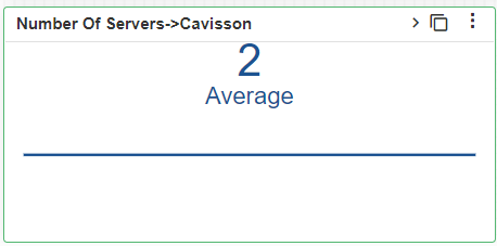
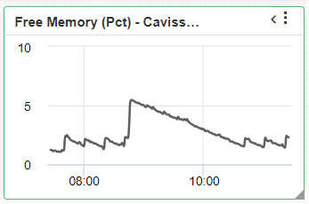
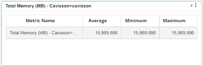
Image Widget
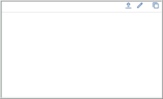
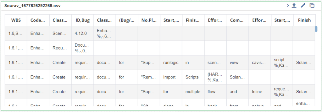
Image widget is used to plot any image on the panel. Using this, you can add snapshots in reports for better understanding of data. You can edit the panel caption by clicking the Edit Title  button. Click the Upload Image
  button within the image widget and select an image from your computer. This displays the selected image within the panel.
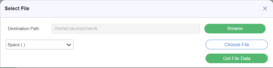
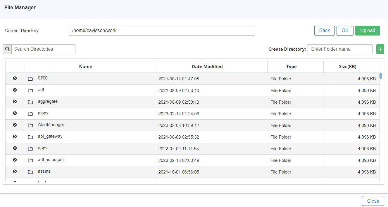
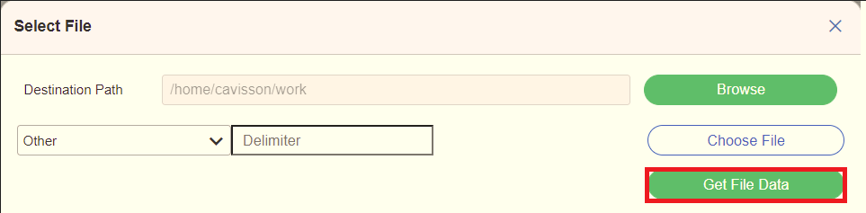
In Select File Window, you have to select the file which is to be uploaded on the destination path.
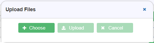
Note: If you want to upload the file from local, you have to click on the Choose File  button.
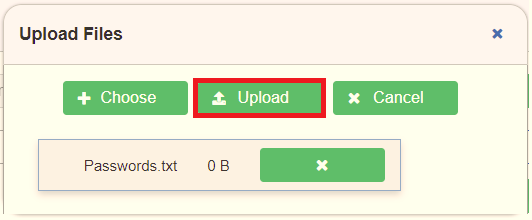
On clicking the choose file button, the Upload Files dialogbox will appear as shown in below Figure 158
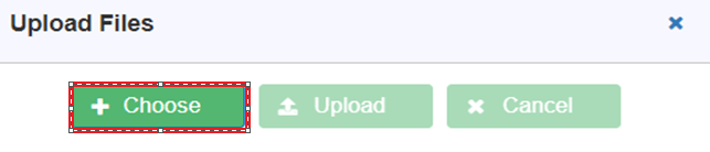
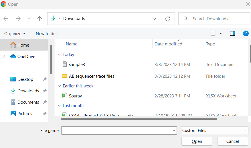
To upload a file from your local, click on the Choose  button. On clicking the choose button, a dialogbox will appear and you have to select the required file (s) to be uploaded as shown in below Figure 159.

Notes:
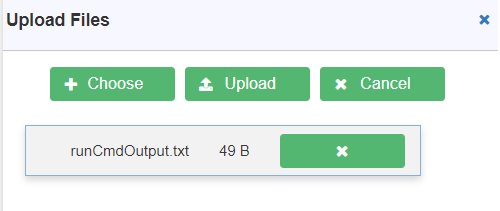
- To upload the selected file, click on the Upload
 If you don’t want to upload the file, you can click on the Cancel
  button.
 - You can choose the following file formats for uploading the files such as: .txt, .csv
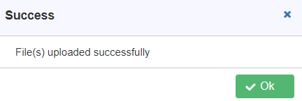
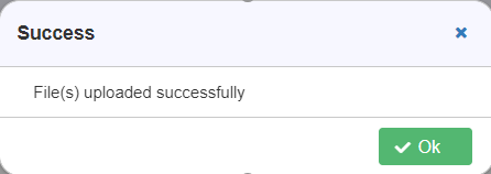
Once you click on the Upload button, it will display a success message as shown in below Figure 161. Click on Ok  to close the window.
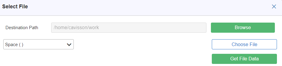
On the Select File Window, click on the Get File Data  button to display the data on the widget as shown in below Figure 163.
Notes:
- You can expand the window by clicking on the Expand
 icon To collapse the window, click on the Collapse icon.
 - You can also upload a file, to upload a file click on Upload
 button.
 - You can also edit the title name by clicking the edit the title of the widget by clicking on the Edit Title

- You can also clone a widget i.e.: making a duplicate of the widget by clicking on the Clone Widget

Selecting a File from Server
- To select a file from the server, locate the CSV file and click the Choose File button. On selecting this, File Manager window will be displayed. The file path gets added in the Select File dialog box.
- Select the column delimiter from the drop-down list. By default, we have Space (), Comma (,), Pipe (|) as column delimiter. If any other comma delimited needs to be specified, select ‘Other’ from the drop-down list and specify the delimiter.
- Click the Get File Data button to get the file data in tabular format on the widget.
- Click the Choose button and select the file from local.
Notes:
- To upload the selected file, click on the Upload button. If you don’t want to upload the file, you can click on the Cancel button.
- You can choose the following file formats for uploading the files such as: .txt, .csv
Once you click on the Upload button, it will display a success message as shown in below Figure 168. Click on Ok
to close the window.- To upload the selected file, click on the Upload
 button. This displays the Save As Layout dialog box. Click OK for saving the layout.
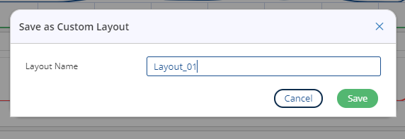
 icon. This displays the Confirmation dialog box. Click on No
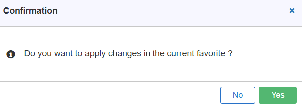
 icon.
icon.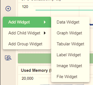
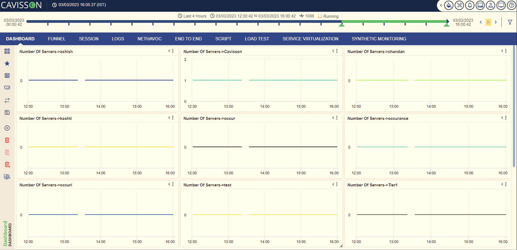
In Add Widget option, you can add the following types of widgets in Canvas Mode which are listed below:
- Data Widget
- Graph Widget
- Tabular Widget
- Label Widget
- Image Widget
- File Widget
Note: For more details on different types of widgets, refer to Add Widget section.
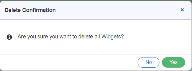
Remove All Widgets
To clear all widgets, click the Remove All Widget  icon. This displays a dialog box prompting for deleting all widgets as shown in below figure.
On clicking Yes  button, all the widgets are deleted as shown in below figure.
 icon. This displays a dialog box prompting for removing the widget.
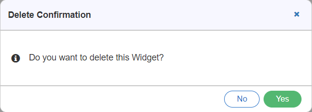
On clicking Yes  button, the selected widgets will be deleted as shown in below figure.
Note: In case a user doesn’t want to delete all widgets, they can click on No  button.
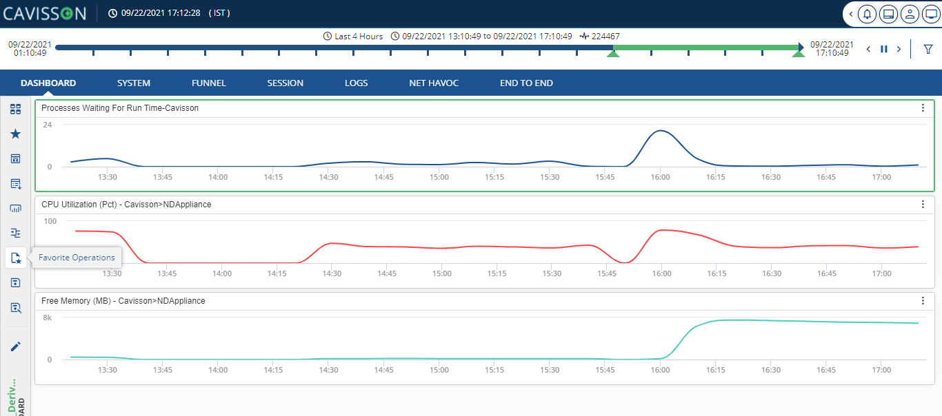
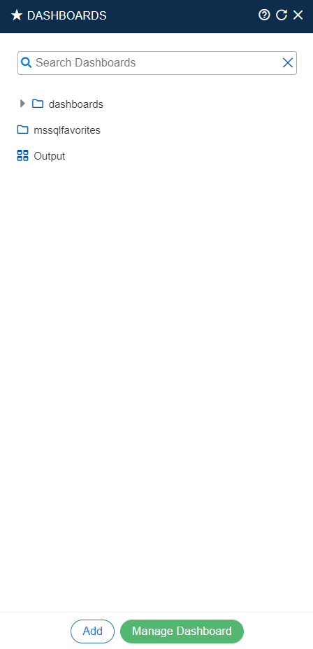
Save Layout as Favorite
Once the layout is designed with widgets on the panel, you need to save it as a favorite for report generation. To do this, follow the below mentioned steps:
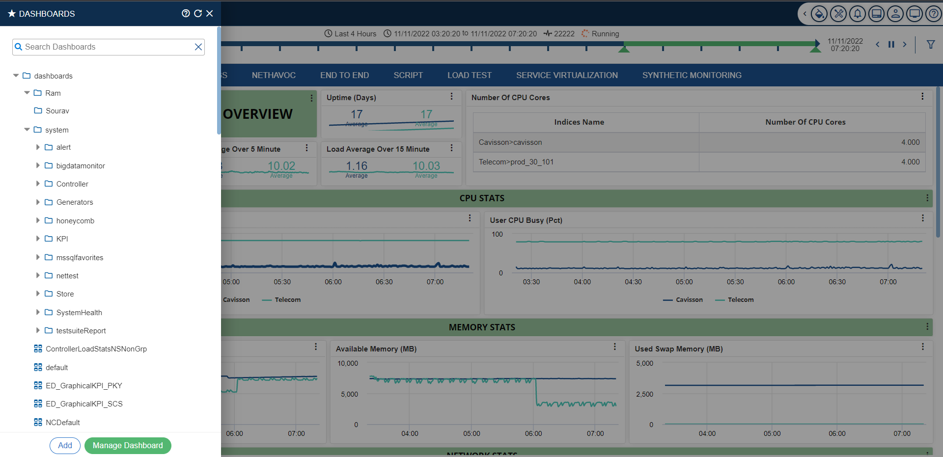
- Click the Dashboard
 icon on the top left corner of the window. Click on the Dashboard List The dashboard list option is displayed.
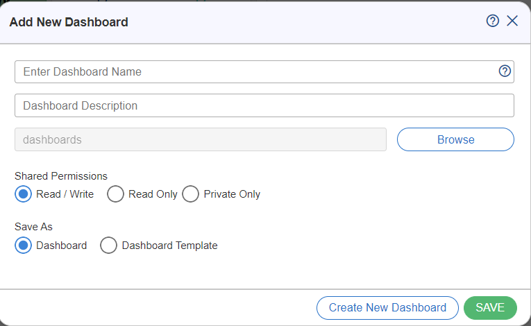
- Click on the Browse
 button, the File Manager window will be displayed.
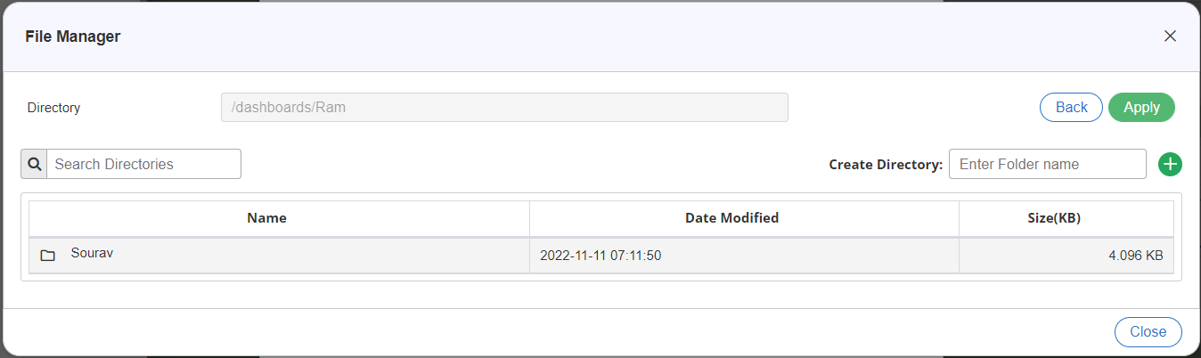
- Enter the path where the directory needs to be created, in Create Directory Click on Add
 button to add the directory to the table.
Notes:
- To create the favorite on root, just click Apply
 button.
 - To create it within an existing folder, select that Folder.
- To create it within a new folder, click the Create Folder button and specify the folder name.
- To create the favorite on root, just click Apply
- Once the directory is added on the table, click on the Apply button.
- The added favorite will be displayed on the Dashboard Favorite List
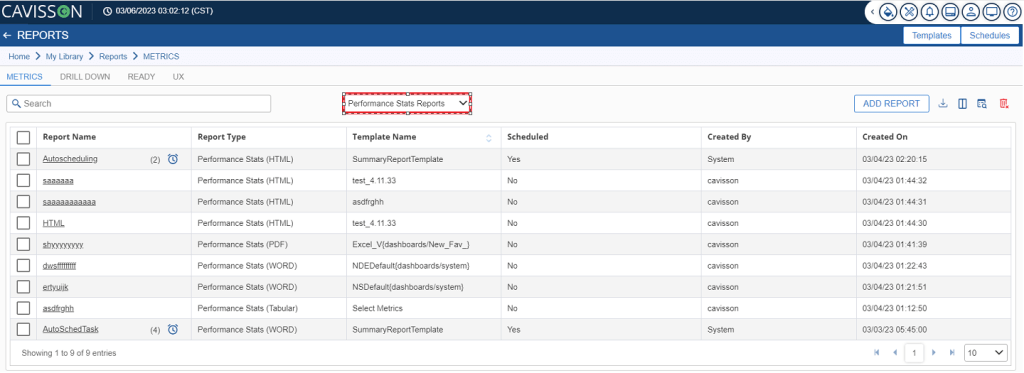
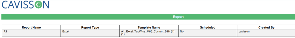
3. To create a new Performance Stats Report click Add Report  button.
4. This displays the add report window.
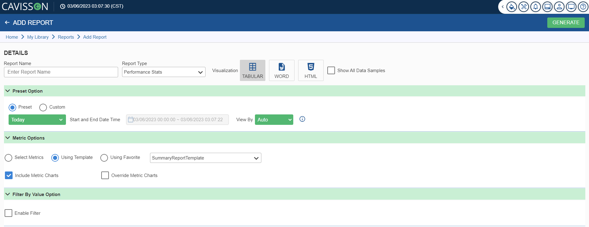
5. In the Add Report window, user has to enter the following details:
Details
In details, there are following fields are listed below:
- Report Name: Here the user has to enter the report name.
- Report Type: Here the user has to select the report type.
- Visualization: Here the user has to select the type of visualization such as: Tabular, Word, and HTML.
Note: If you want to display all the data samples of the generated report, then click on the Show All Data Samples checkbox.
Preset Option
In preset option, there are following two options:
- Preset: A user can apply the following presets available:
- Live: To view live data. For example – Last 5 minutes, Last 10 minutes, Last 30 days, This week, This Month, This year.
- Past: To view past data. For example – Last week, Last 2 weeks, Last 2 months, Last year.
- Events: To view data for some specific events. For example – Black Friday, Christmas Day, Good Friday, and Cyber Monday.
- Custom: To fill the start & end date and time. It is enabled when you do not select the Preset option.
- View by: To specify the format of aggregated data (such as hours, minutes, and seconds) based on the selection of the Preset option. View by contains the following options:
- Auto: It is used to select sample intervals automatically as per duration of compared measurements.
- Second: It contains the values, such as 10 Sec, 20 Sec, 30 Sec, 40 Sec & 50 Sec.
- Minute: It contains the values, such as 1 Min, 2 Min, 4 Min, 5 Min, 10 Min, 15 Min & 30 Min.
- Hour: It contains the values, such as 1 Hours, 2 Hours, 4 Hours, 6 Hours & 12 Hours.
Metric Option
- There are following options available which are listed below:
- Select Metrics
- Using Template
- Using Favorite
- In Select Metrics, the user has to fill up the Metric Selection having the following fields:
- Report Sets: In this field, the list of report sets is shown which has been added by the user.
- Report Sets Details: In this field, the user has to provide the report set name.
- The user has to select the Graph Type, Chart Type, Formula Type.
- On selecting the Threshold option, the user has to provide: Minor, Major, and Critical values.
Note: If a user selects the Charts Per Subject option, the chart data will be shown in Per Metric Chart format.
- Metric Group: In this field, the user has to select the metric group which they want to use.
- Metrics: In this field, the user has to select the type of metric that they want to use.
- Subject:
- In this field, the user has to select the subject.
- There are following two options:
- All: If a user selects this option, then the metric will be applied on all subjects.
- Selected Subject: If a user selects this option, then the metric will be applied only on the selected subjects.
Note: After filing up all the details, the user has to click on the Save as Template option in order to save the template.
Filter By Value Option
In Filter By Value Option, the user can select from the following options listed below:
- All Non-Zero: Displays the graphs with non-zero values.
- All Zero: Displays the graphs with zero values.
- Advanced: Displays some advanced level operations as below.
- Value: There are following filter options, such as <, >, <=, >=, Top, Bottom, In between, which helps to achieve the desired output.
- By: You can filter graph values by Min, Max, and Avg values of its graph data. You can also use the Include or Exclude options to get the filtered results.
Notes:
- The user has to click on the Enable Filter option, in order to apply the filter.
- After filing up all the details, the user has to click on the Generate
 button to generate the template.
 - Once you have filled up all the required details on the respective fields, click on the Generate This generates the report in PDF format as shown in below figure.